HOW TO BOOK TIME TRAVEL
The Challenge: Design the branding and create responsive e-commerce web and mobile sites for Zeit, a company that sells travel packages to the past.
Deliverables:
Develop brand identity
User research
Competitive Analysis
Wireframes
Clickable interactive prototype of web design
UI Kit
Original logo and copywriting
Time Span: six weeks
I created my own road map: I needed to research what works and what doesn’t TODAY when it comes to searching, filtering, and planning travel.
Through research, I aimed to better understand:
How people book travel and common pain points
How the booking process and common site features can be improved
How people find locations and events that relate to their interests
Research methodology used:
Competitive analysis
User interviews and surveys
Market research
User Needs:
100% of survey participants said photos and transparent fees are the most important features on a travel booking site
80% of survey participants said maps, filters and customer reviews are extremely important to them when booking travel online
40% of survey participants said they want more personalized offerings tailored to their interests and personalities
User Pain Points:
100% of survey participants said current booking sites do not have enough filters
80% of survey participants said they struggle with untrustworthy customer reviews
80% of survey participants said they strongly dislike the pressure to make decisions quickly before offerings expire or sell out
Interviews expressed skepticism regarding pre-planned “packages” as too touristy and not relevant to their interests
Although time travel isn’t the most common form of travel today (yet…) the insights still apply to how we book, plan and search for things in our every day lives.
Competitive Analysis
Interviews and surveys revealed that the most popular travel booking websites are AirBnb, Southwest.com and Kayak.com
Interviewees and survey participants liked these websites because of flexible cancellation policies, interactive maps and plentiful customer reviews. Based on the feedback, I developed a new custom feature that relied on personalized suggestions.
Market Trend Research
Based on my research, I found that 80% of survey participants found customer reviews untrustworthy.
They also expressed desire for personalized travel suggestions to fit their style.
I developed an original feature that would allow people to see reviews by people they know or by people who share their interests and travel style.
I also creatd an optional travel quiz that would offer specific trip suggestions and ideas.
I conducted a card sorting study to understand how information should be organized on the website and how people visualized booking travel in the past.
Fundamentally, I wanted to understand if users made a distinction between destinations that were 1) specific events in time (eg. MLK’s 1963 “I have a dream” speech) and 2) destinations that were location based (eg. Ancient Greece).
Information Architecture
Task and User Flows were created to understand how users would search for and find locations that exist in both unique physical places and in unique time periods. Time travel booking has challenges not typical of existing online booking websites.


Users had an overall positive impression of the site- multiple usability testers noted that the site was creative but intuitive, delightful and had an element of surprise. Usability testing revealed three primary areas for improvement:
1) Site navigation
2) Prototype interactivity
3) Visual hierarchy
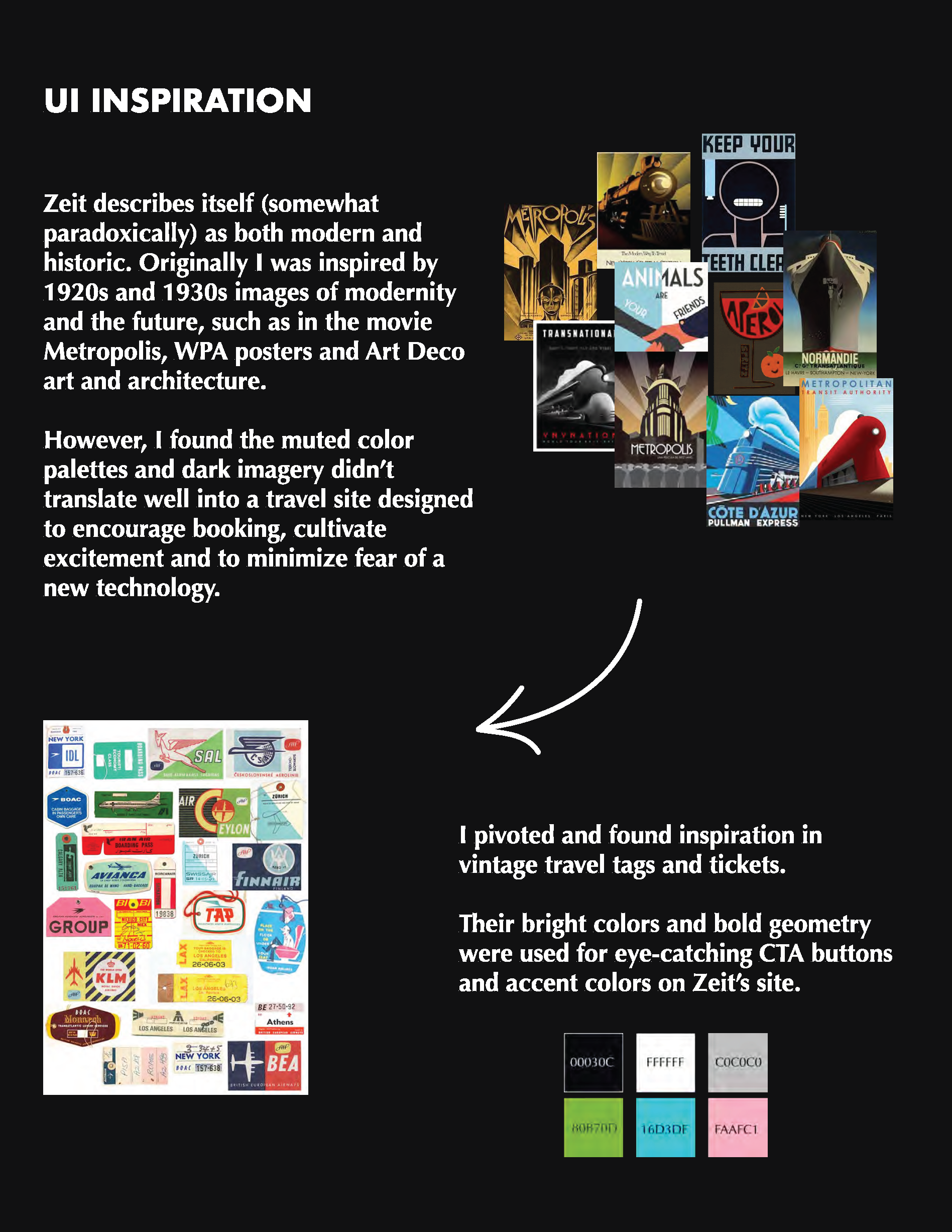
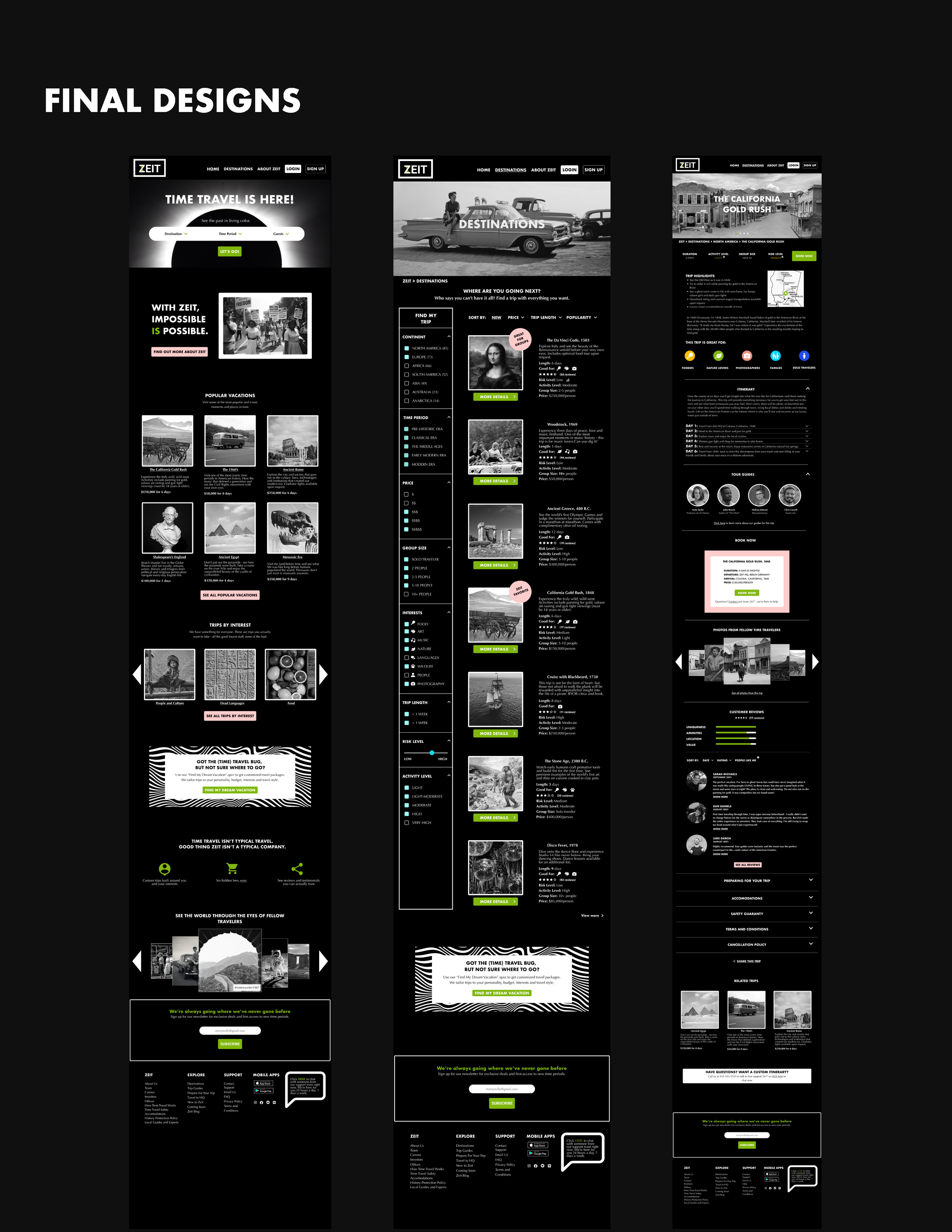
I developed a clickable prototype that would allow users to search for and book a trip. I tried to add elements that not only were necessary to complete the booking process, but added joy and surprise as well. The prototype allowed users to move from the homepage, search for a destination and complete the entire booking process.
Clickable Prototype
Usability Testing
Final Results
After making improvements based on user feedback I repeated testing with previous users and with users who had never before seen the site design. The final result was easier to navigate and had an increased number of clickable components.
The final design was found by users to:
Be unique and visually interesting especially when compared with typical travel booking sites
Contain high quality information and a high level of interactivity
Contain pleasurable and delightful surprises throughout the different site pages.
Contain features not found elsewhere (prioritized reviews by people you may know, trip finder quiz).
“I love how detailed it is- the copy makes it feel really ‘real’”
— Participant 1
“I wish I could actually take this trip!”
— Participant 2
“I like that this doesn’t feel like all the other travel sites out there.”
— Participant 6
“There’s so much to click- I feel like I keep finding new things.”
— Participant 7


